Dr. Dino

A webpage showcasing data visualizations of specific phobias in college students and sharing possible treatment options.

Dr. Dino Hero Image

Project Brief: Find a reliable source of raw data that has been interpreted by an expert, and then create data visualizations based on that data.​​​​​​​​​​​​​​

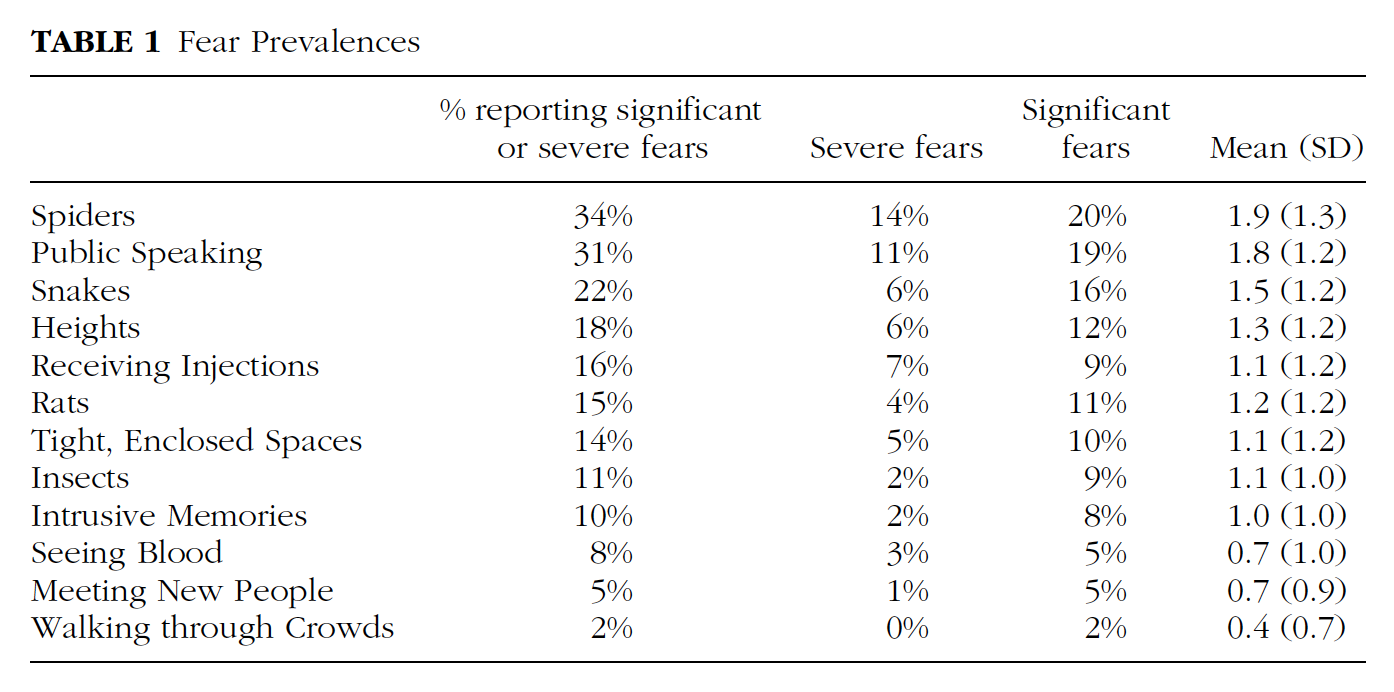
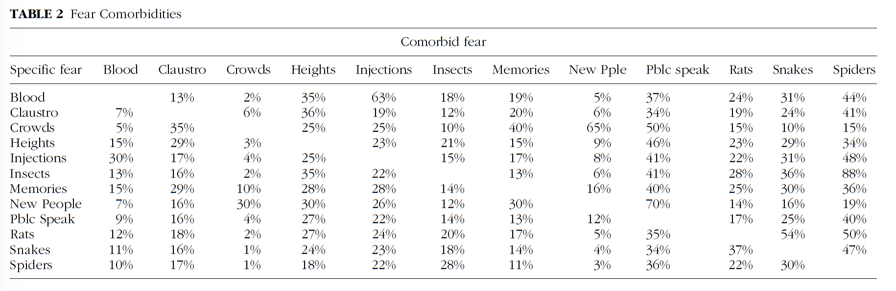
I chose to use three data tables from a research paper by Seim and Spates (2010) titled, The Prevalence and Comorbidity of Specific Phobias in College Students and Their Interest in Receiving Treatment.

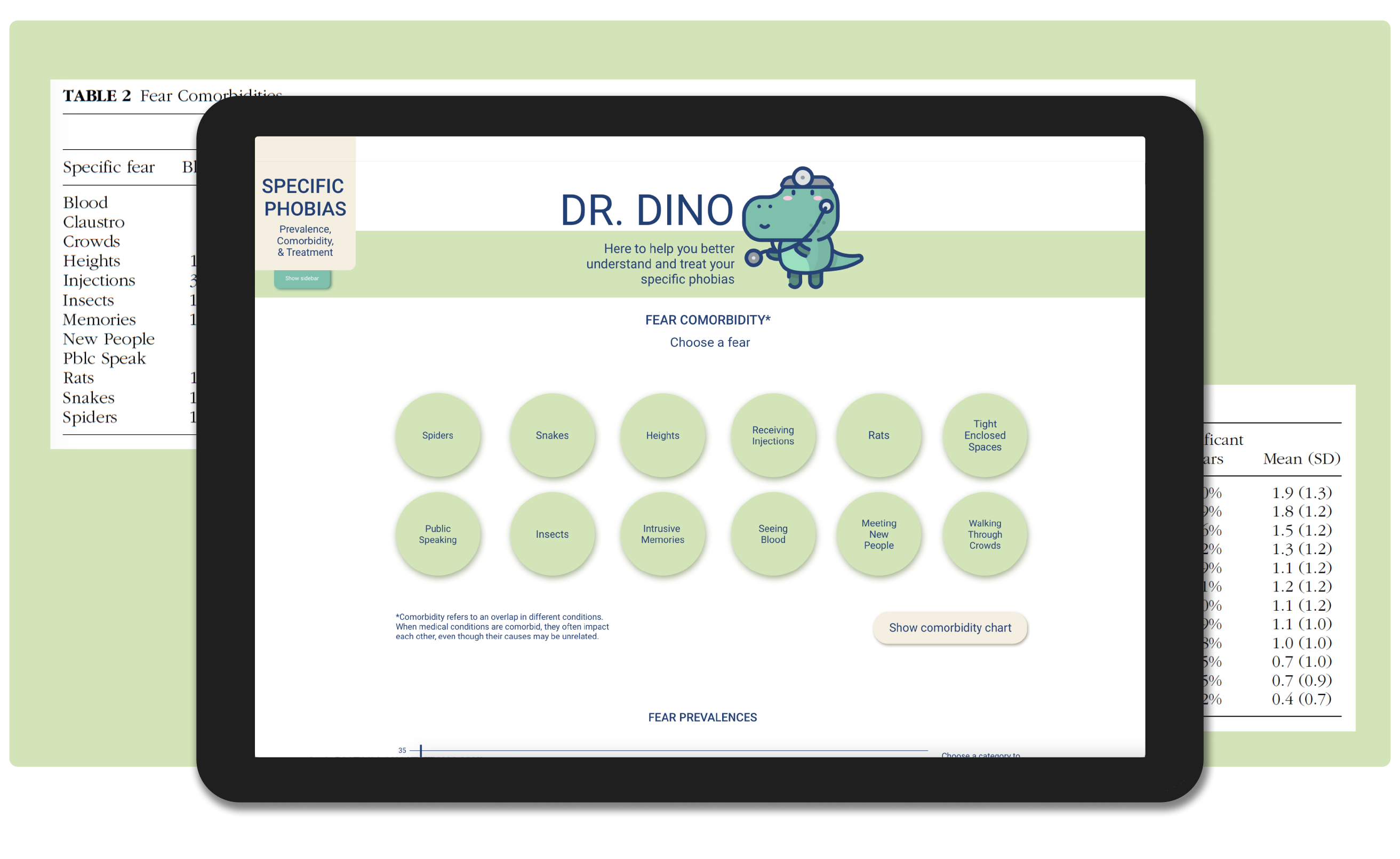
Dr. Dino is a resource for individuals struggling with specific phobias that is playful and approachable, allowing them to learn more about specific phobias in a fun and safe space.

The outcome is a single page website prototype with three interactive data visualizations and a section showcasing possible treatment options.

My RoleDesigner

Project LengthSeptember 2021 - January 2021

Tools UsedPen & paper, Adobe XD, Adobe InDesign

Methods UsedSketching, primary & secondary research, personas, wireframing, clickable prototypes

Data Source

Data table 1Data tabe 2Data table 3

I came across this paper by Seim and Spates (2010) during my research and thought the data presented would be a good fit for this project, as well as my own interests.

Seim, R. W., & Spates, C. R. (2010). The Prevalence and Comorbidity of Specific Phobias in College Students and Their Interest in Receiving Treatment. Journal of College Student Psychotherapy, 24(1), 49-58. 10.1080/87568220903400302.

Who am I Designing For?

Persona

The main user groups are people who are interested in learning more about specific phobias and/or people who have specific phobias who want to learn more about them and about possible treatment options.

Key user needs:

  • Learn about specific phobias and treatment options
  • Data that is easy to understand and not overly technical
  • Calm and fun learning environment

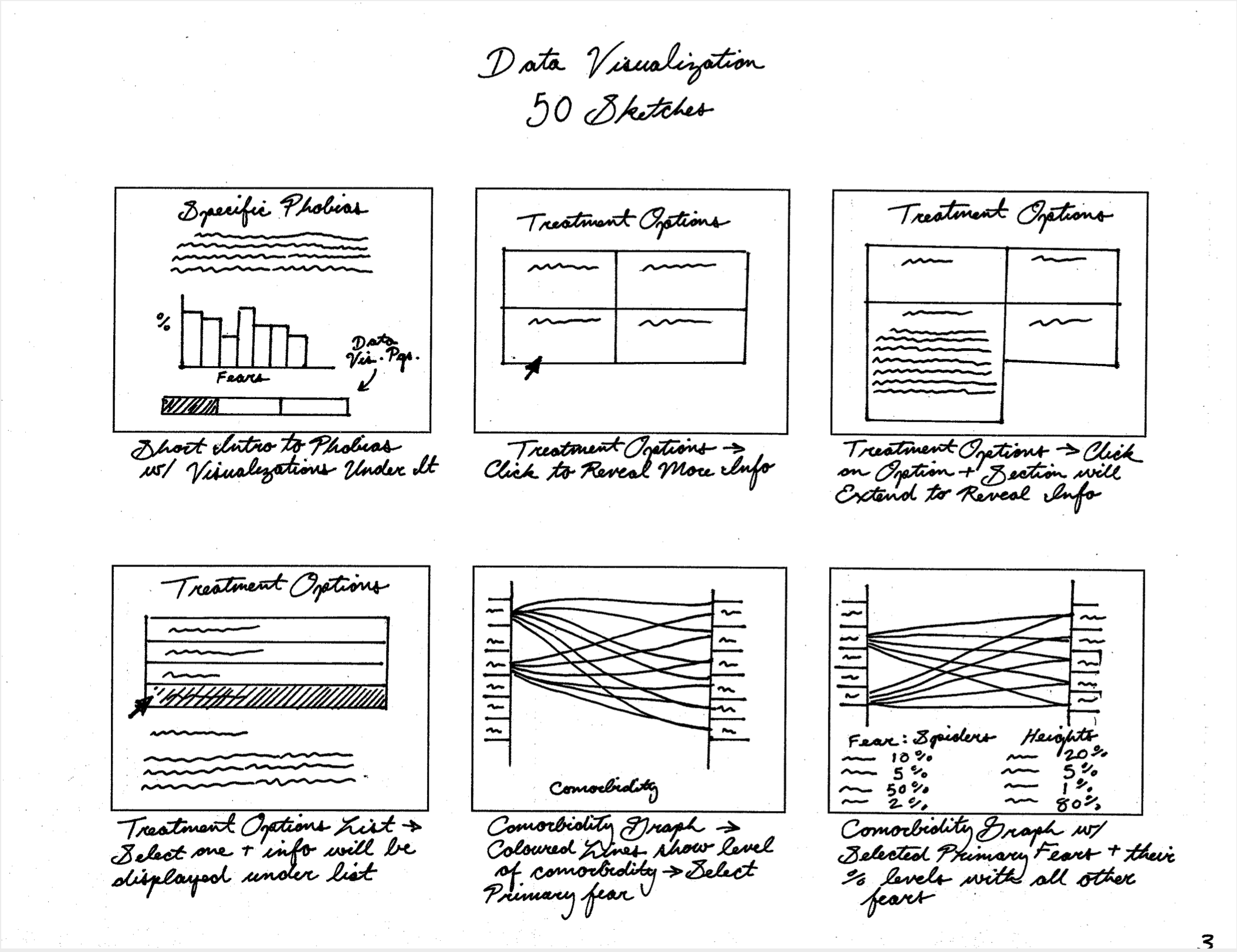
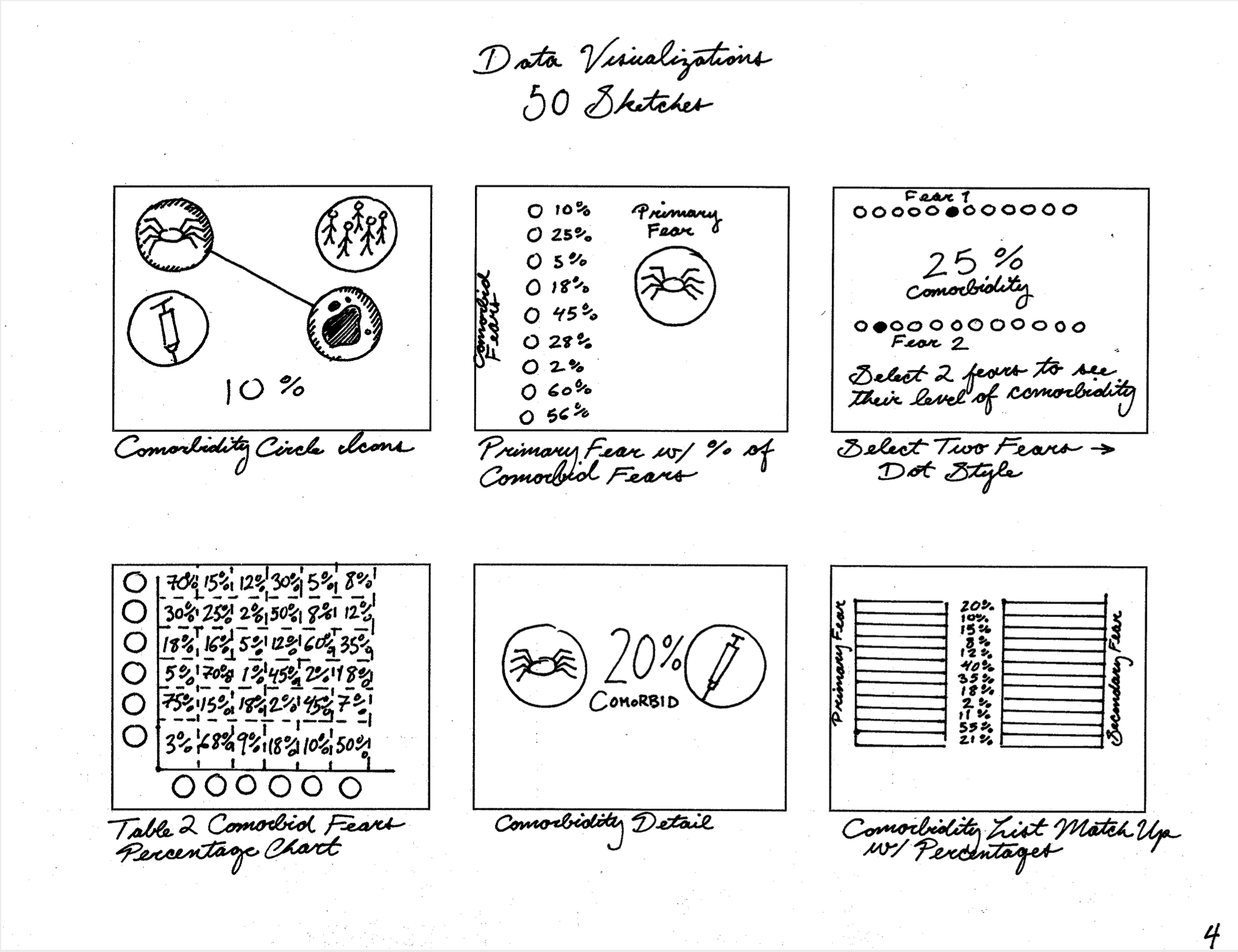
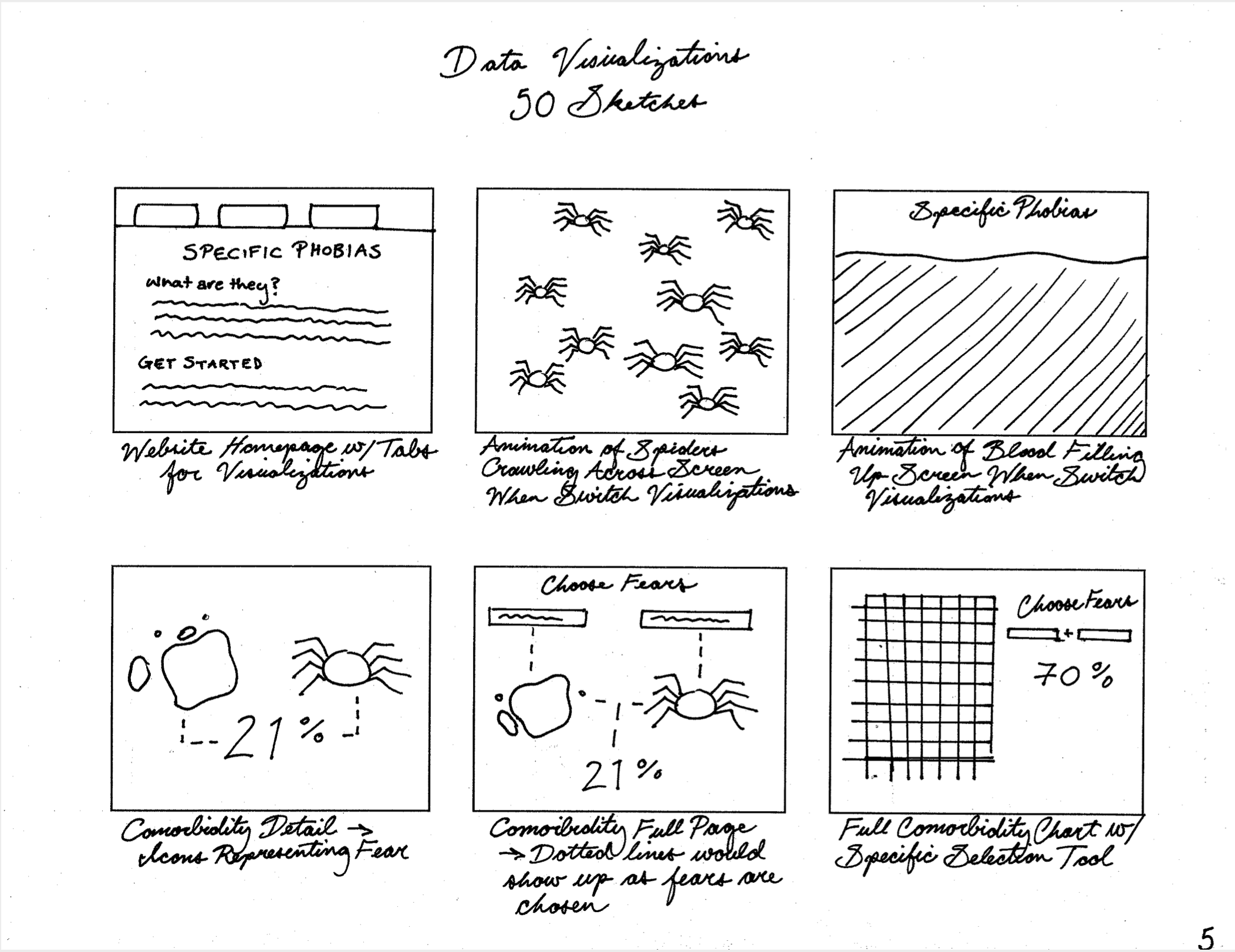
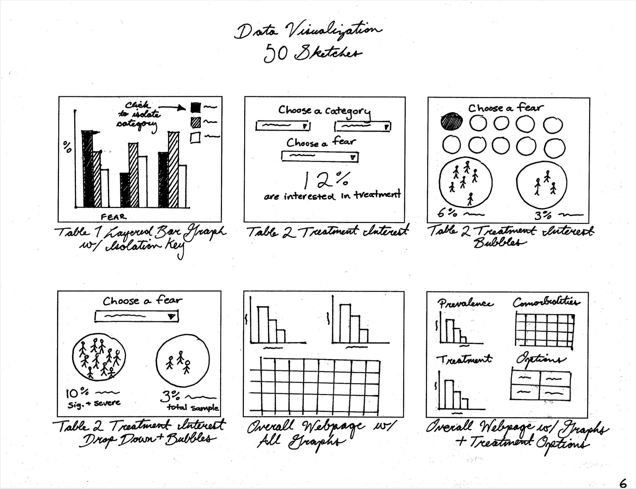
54 Sketches

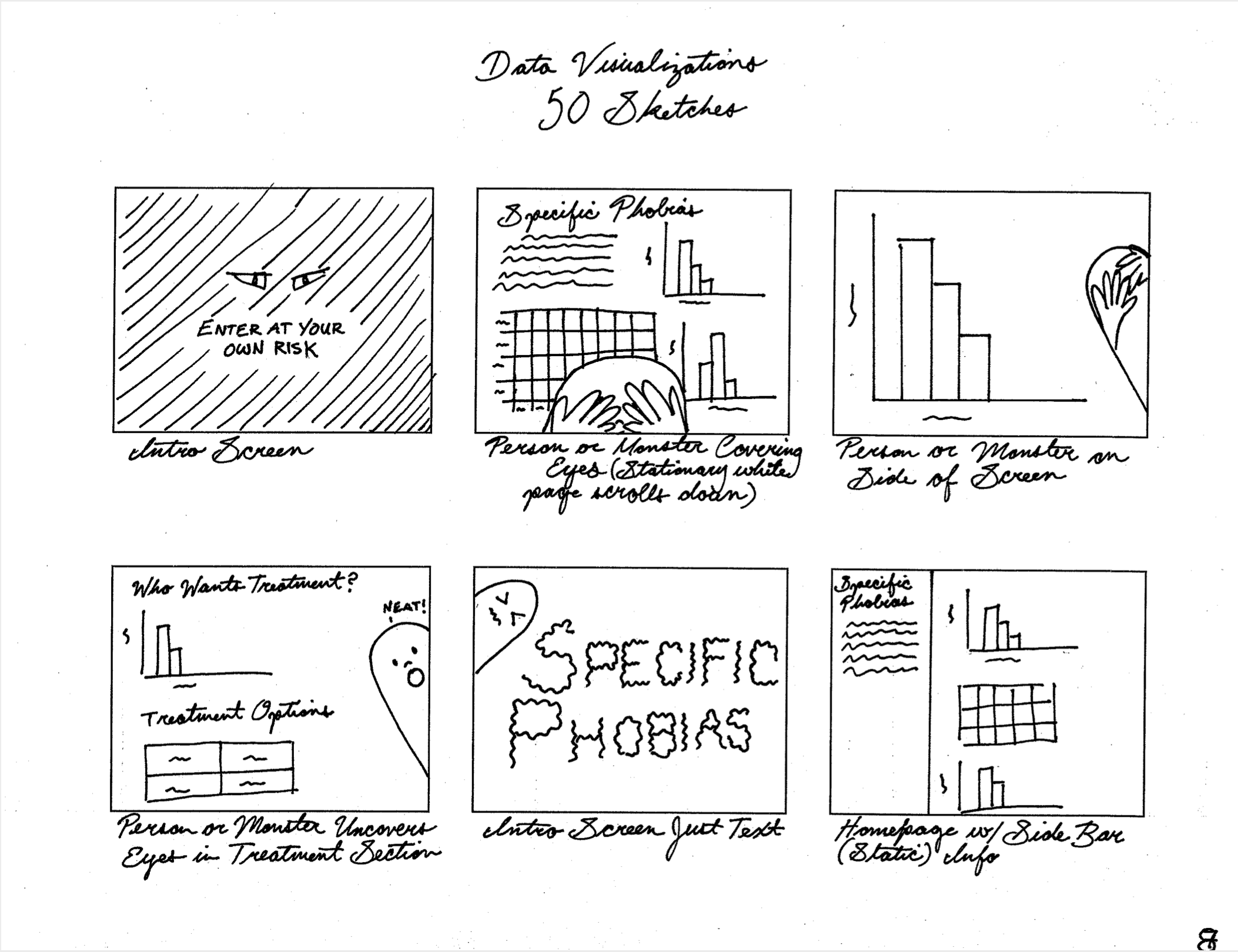
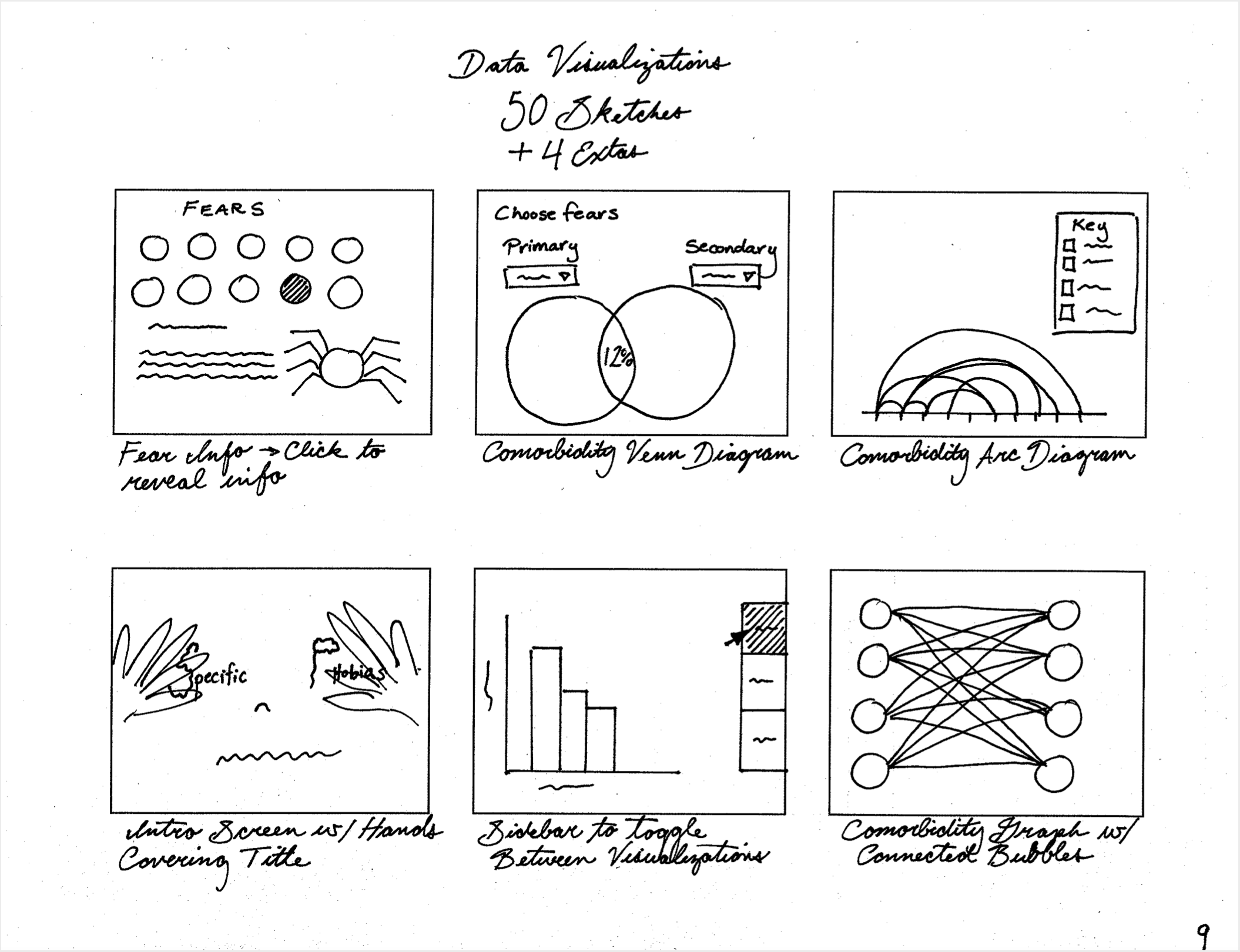
These are 54 sketches I made of possible data visualization designs and design elements.

I chose to move forward with the layered bar graphs to visualize Table 1 and Table 3 and for Table 2 I created several options to user test, in order to see which layouts the participants responded to the best.

I also chose to move forward with the monster character shown on page 8, but it later evolved into the dinosaur mascot character.

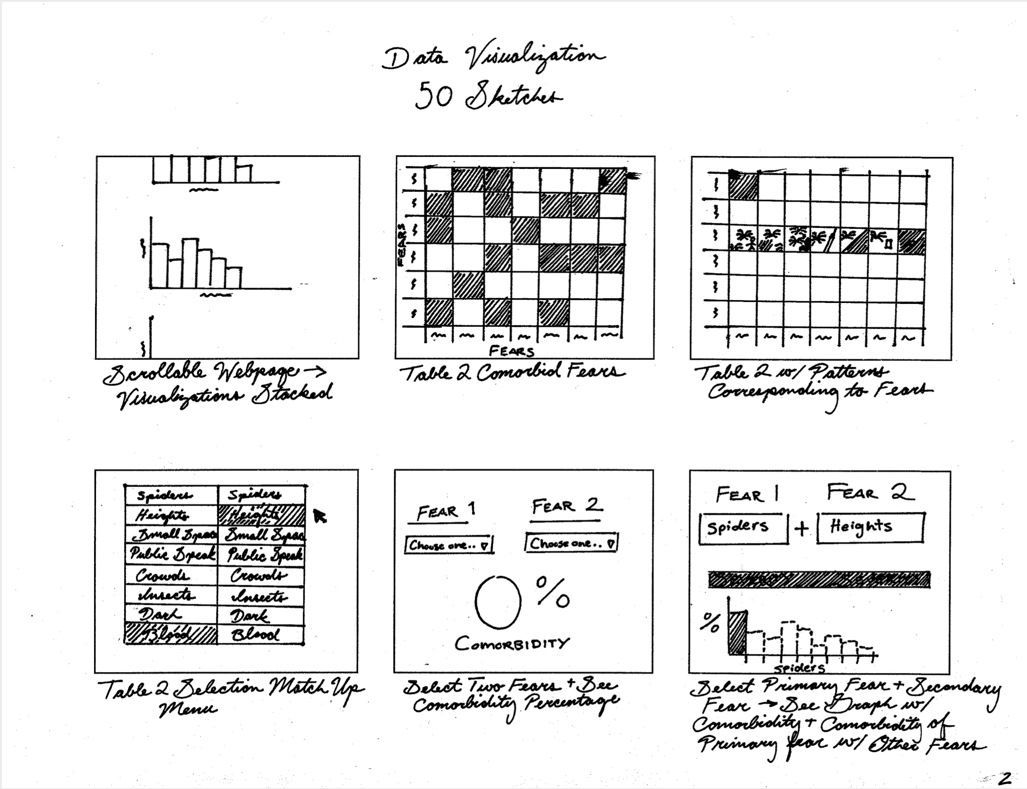
6 sketches6 sketches6 sketches6 sketches6 sketches6 Sketches6 sketches6 sketches6 sketches

Prototype I


I created multiple versions of the webpage layout, treatment options section, and comorbidity section, so that users could give me feedback on which versions they preferred and why.
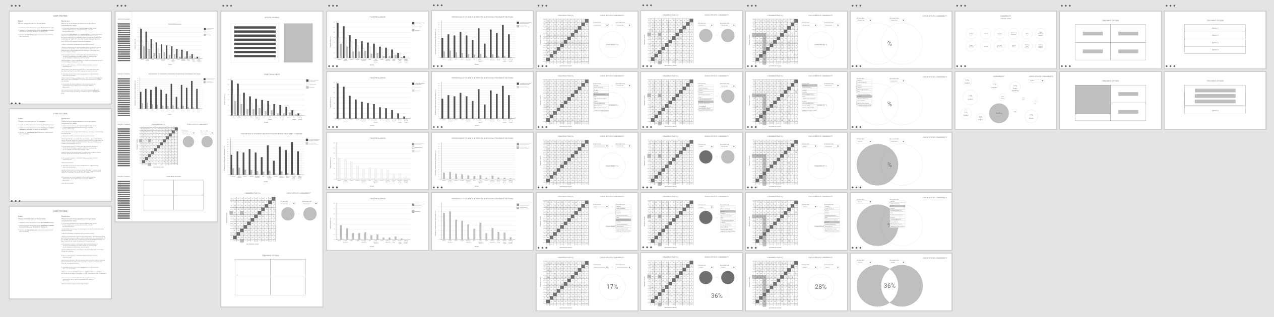
1st Round User Testing Feedback

  • Users were split on their preferences
  • Comorbidity with multiple bubbles was the preferred design
  • Wording needs to be simplified
Prototype 1 overview

Prototype II

In this prototype I added more design elements, such as colours, the dinosaur character, buttons, and typography.

I narrowed down the comorbidity visualization and treatment options visualization options based off of user feedback, and added the option for users to hide and reveal a sidebar with information about specific phobias displayed on the full webpage.

Prototype 2 overview

2nd Round User Testing Feedback

  • Add a website header
  • Wording needs to be simplified
  • Use dinosaur character sparingly
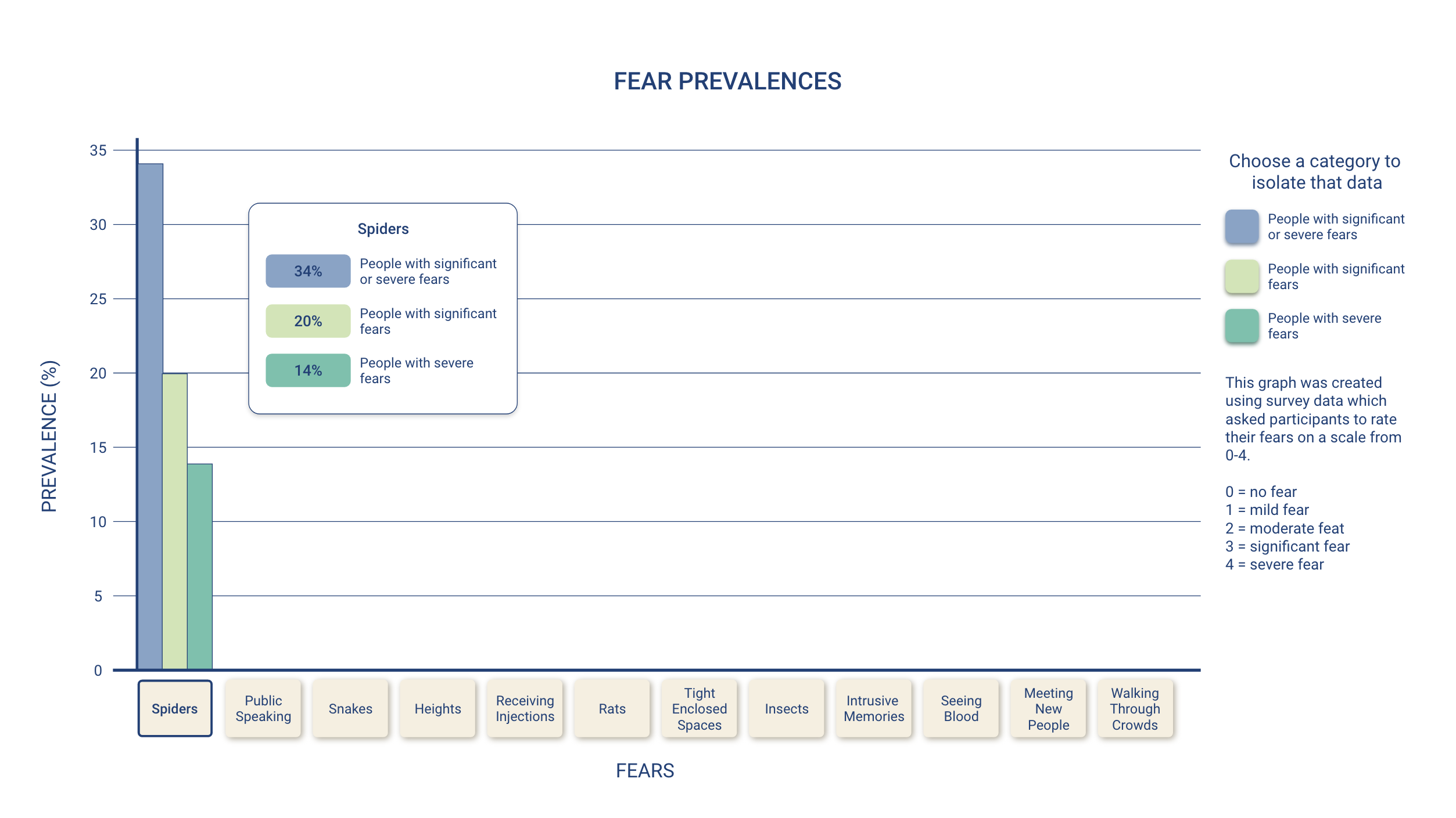
  • Add ability to isolate specific data for each fear on bar graphs

Deliverables

Prototype III

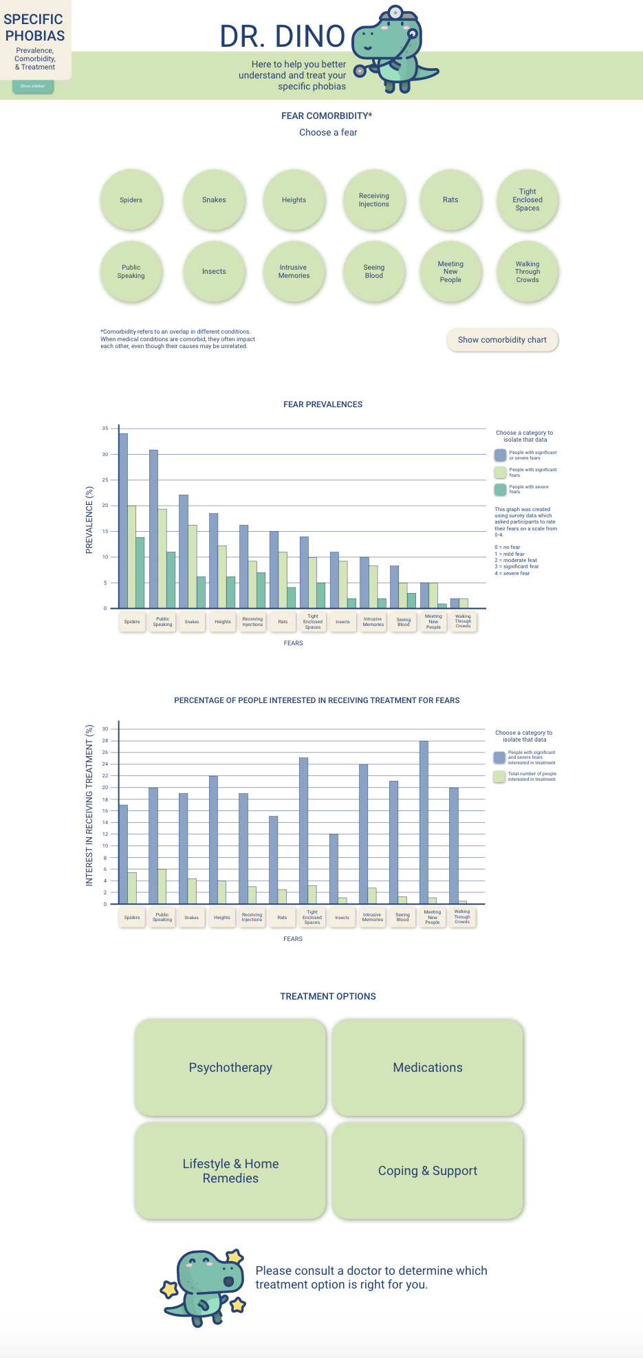
  • Data is presented simply with an emphasis on visuals to aid comprehension and understanding
  • Original data source is provided and briefly explained on the sidebar of the webpage
  • UI help to add a sense of calm and playfulness
  • Different data display options are available
Full website with sidebar collapsed
Full webpage with sidebar open

Table 1: Fear Prevalences

Fear prevalences data viz
Fear prevalences data vix with data isolated

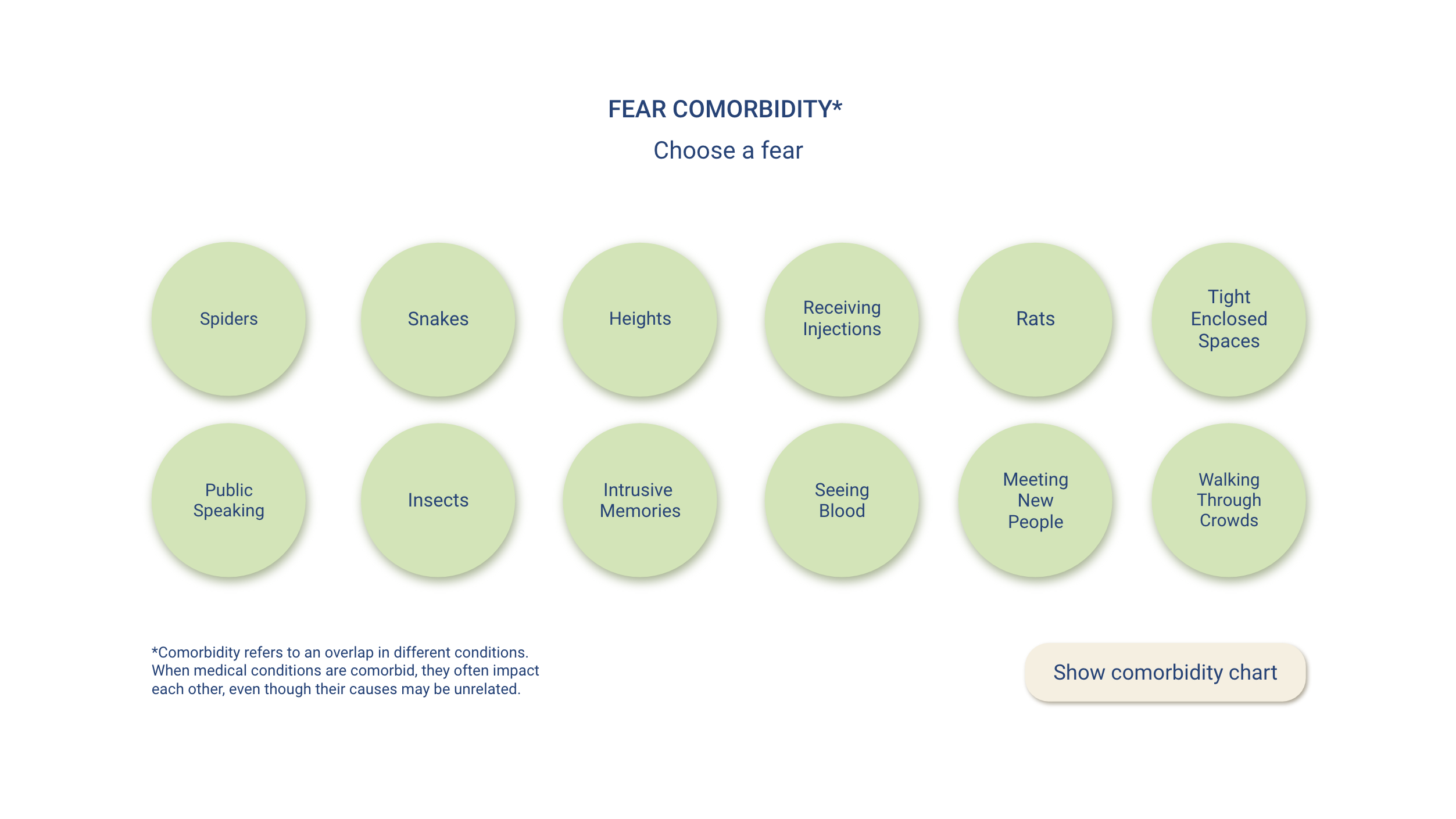
Table 2: Fear Comorbidities

Fear comorbidities data vizFear comorbidities data viz with spiders selectedFear comorbidities data viz with chart showing

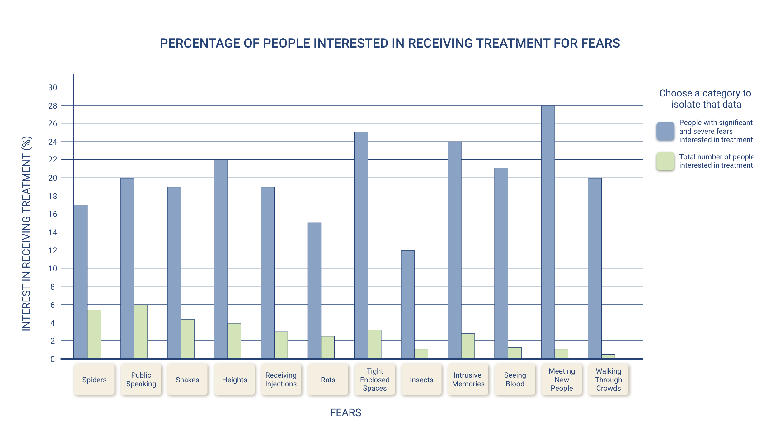
Table 3: Percentage of Students Interested in Receiving Treatment

Percentage of students interested in receiving treatment data viz
Percentage of students interested in receiving treatment data viz with data isolated

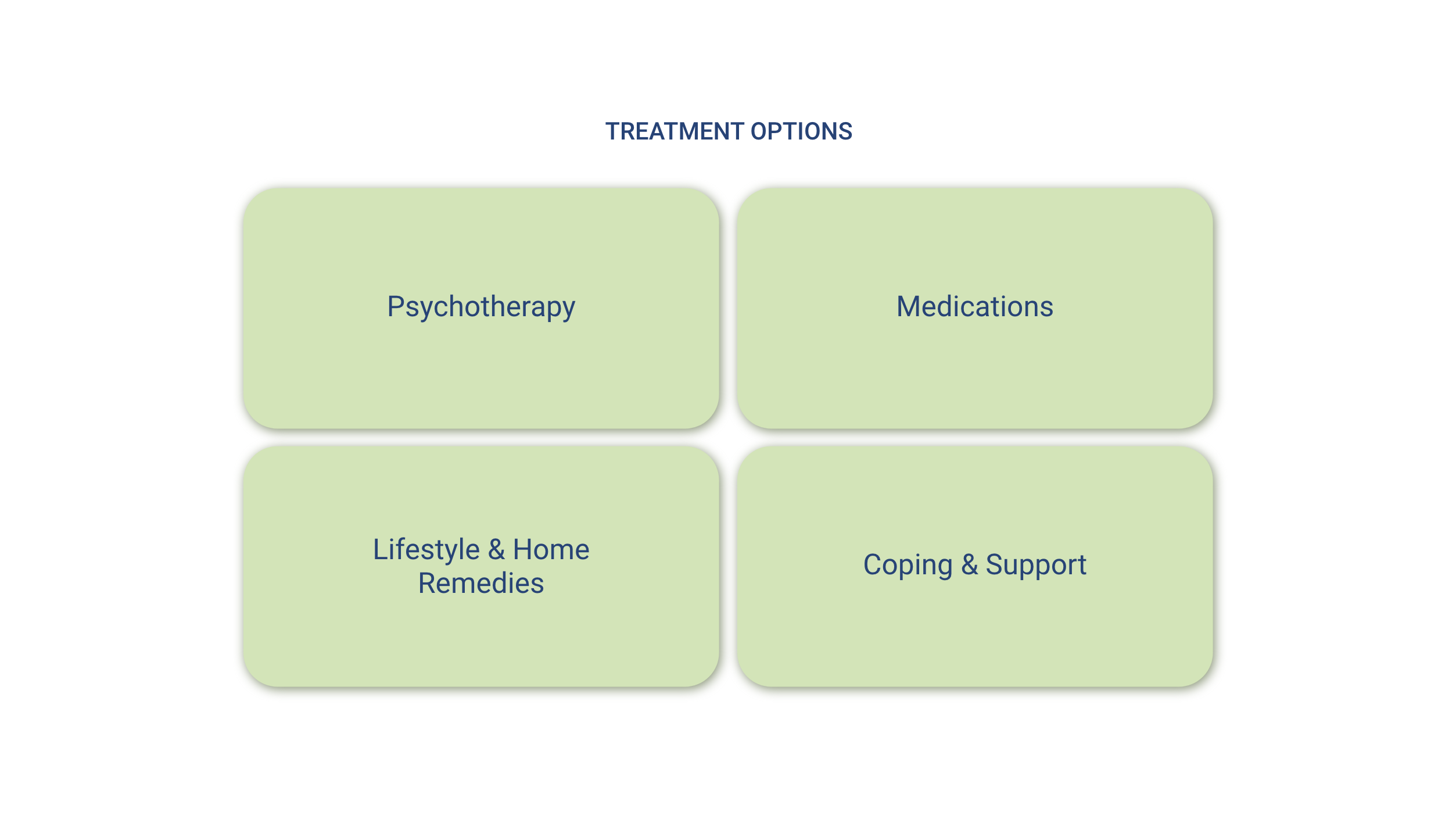
Treatment Options

Treatment options
Treatment options with one open

Reflection

What I learned:

User testing shaped the result of this project greatly. I came into this project with some ideas of how to visualize my dataset, but there were many things that I overlooked and came to realize during the user testing process.

I made many changes with each revision of the prototype, and ideally I think one more round of user testing would have been helpful to gain insight into the design choices I made in the final prototype.

Given more time I would:

  • Design screens showing the specific information for each fear category
  • Design a working prototype with interactions and animations